Ritmofit
project overview
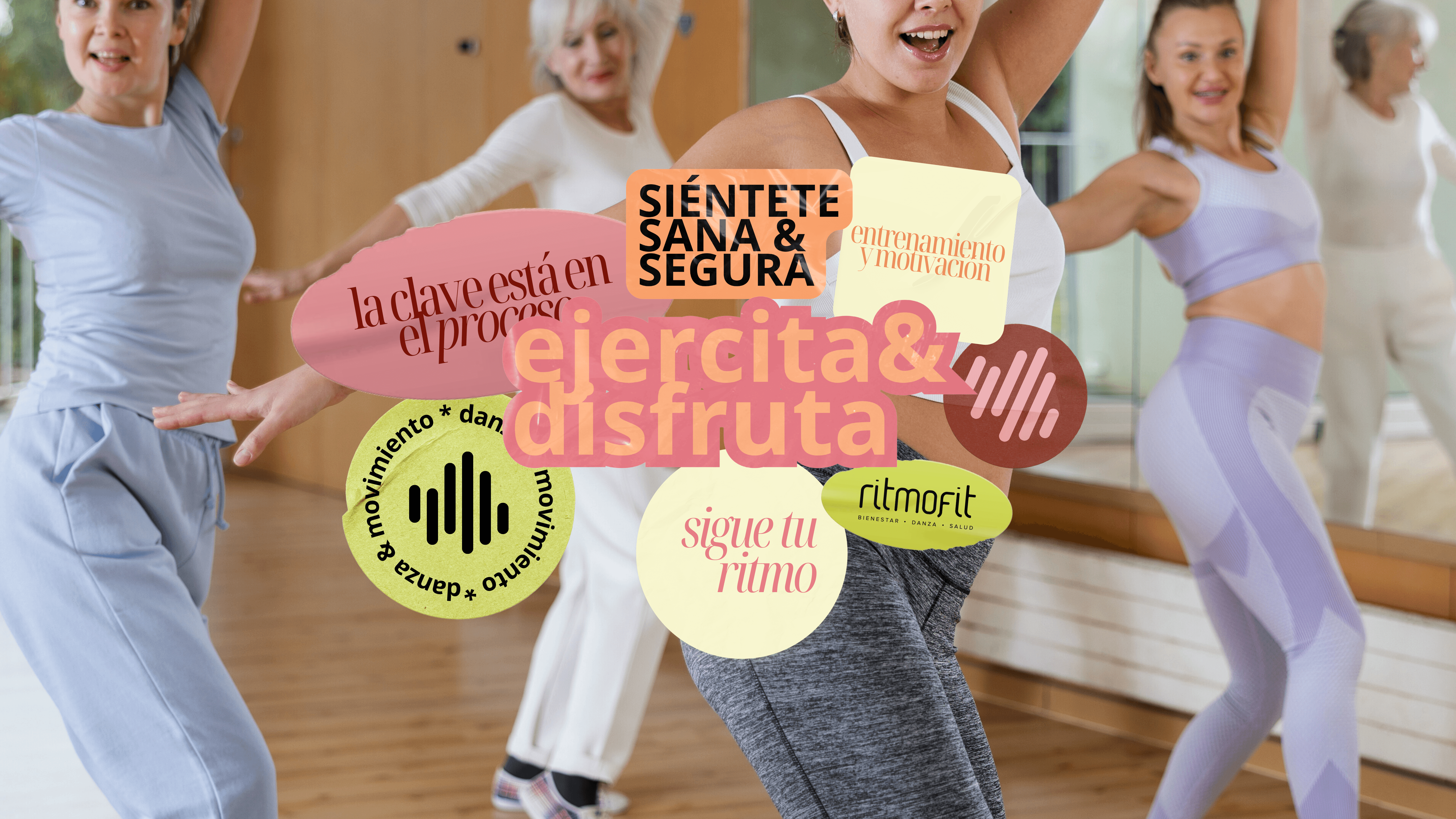
Brand refresh for Ritmofit, a dance academy with over 11 years of experience. The project focused on modernizing the visual identity while preserving the original logo, aligning the brand with current trends and a predominantly young, female audience.

the goal of this project was to refresh the brand while maintaining its recognizability, keeping the original logo intact but redesigning the surrounding visual system to feel contemporary, relevant, and trend-aware. i developed an identity that feels feminine, youthful, and professional, balancing playfulness with structure to communicate confidence, movement, and approachability. the process included expanding the color palette, introducing a wider range of pink tones to add warmth and vibrancy, as well as updating the typography to more modern and versatile typefaces. i also introduced a collage-inspired visual language, creating a system of graphic assets designed as sticker-like elements used to decorate and enrich social media content. these assets intentionally play with ritmofit’s iconic logo and incorporate shapes inspired by soundwave bars, reinforcing the connection between music, movement, and dance. the result is a flexible and recognizable visual identity, built to support ritmofit’s digital communication and reflect the dynamic spirit of the academy.


return